Concept
The purpose of the intervention is to guide the spectator on a visual and typographical journey of distorted memories to incite curiosity about the inner workings of the human mind. As humans, we still have very little understanding of how we process memories, especially when it comes to retrieving the accurate events (Bassett & Gazzaniga, 2011, p.200). The mind can shape its own narrative from altered memories based on our biases and previous lived experiences (Levine, & Safer, 2002, p.120). We rely on these memories to provide us with accurate information to make decisions, but how accurate are they?
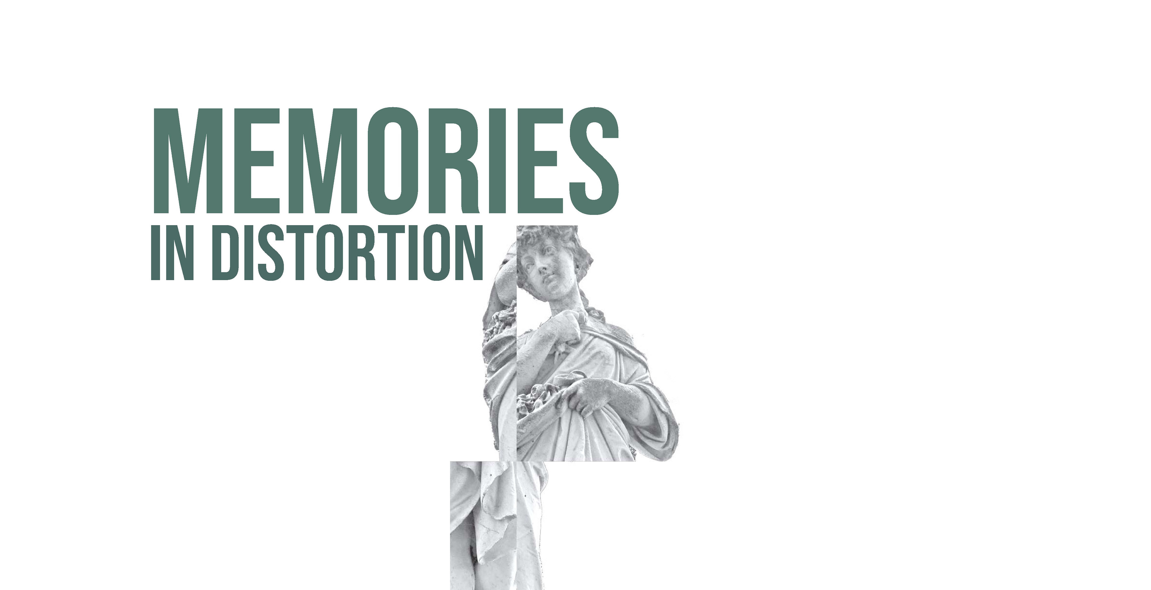
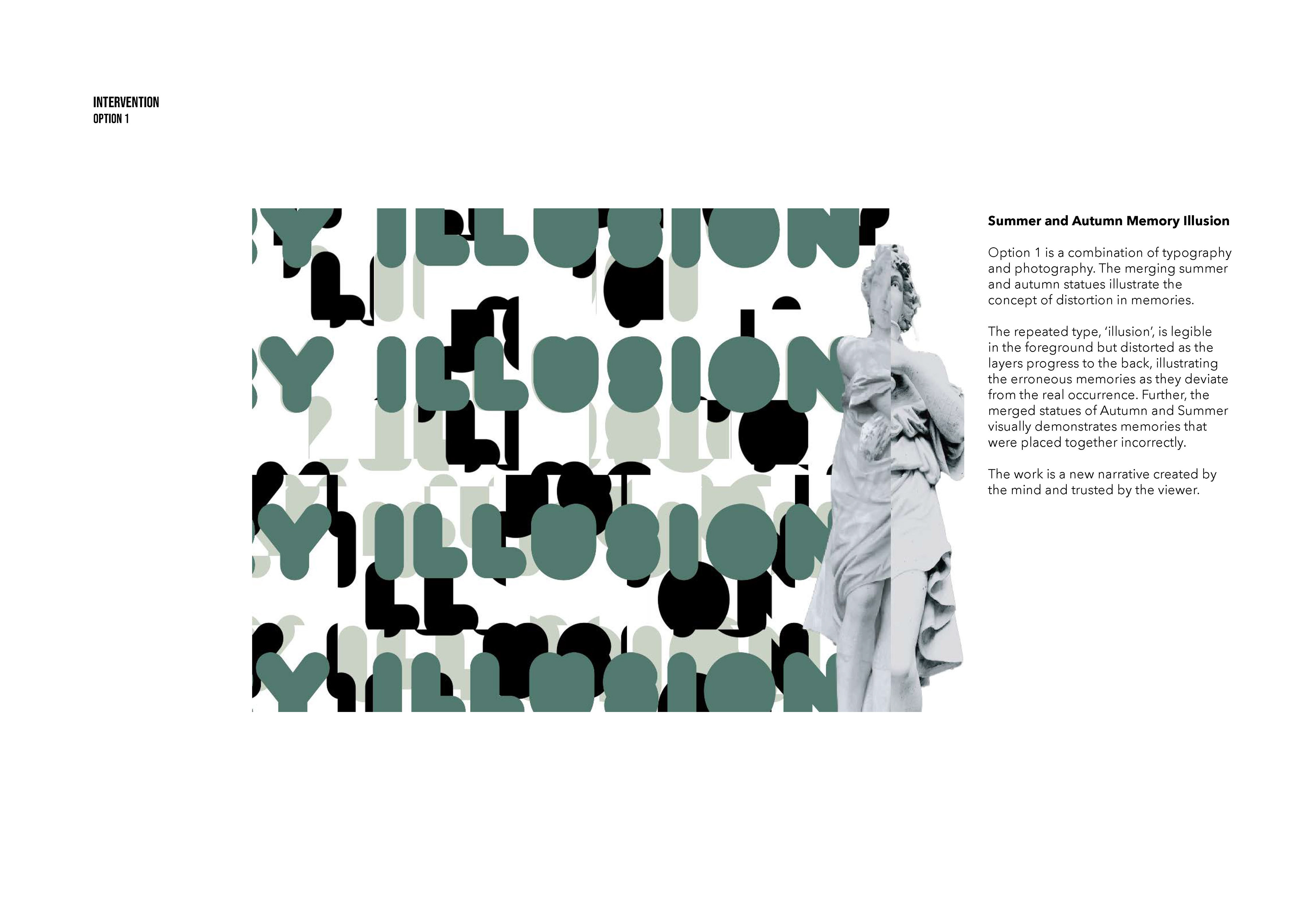
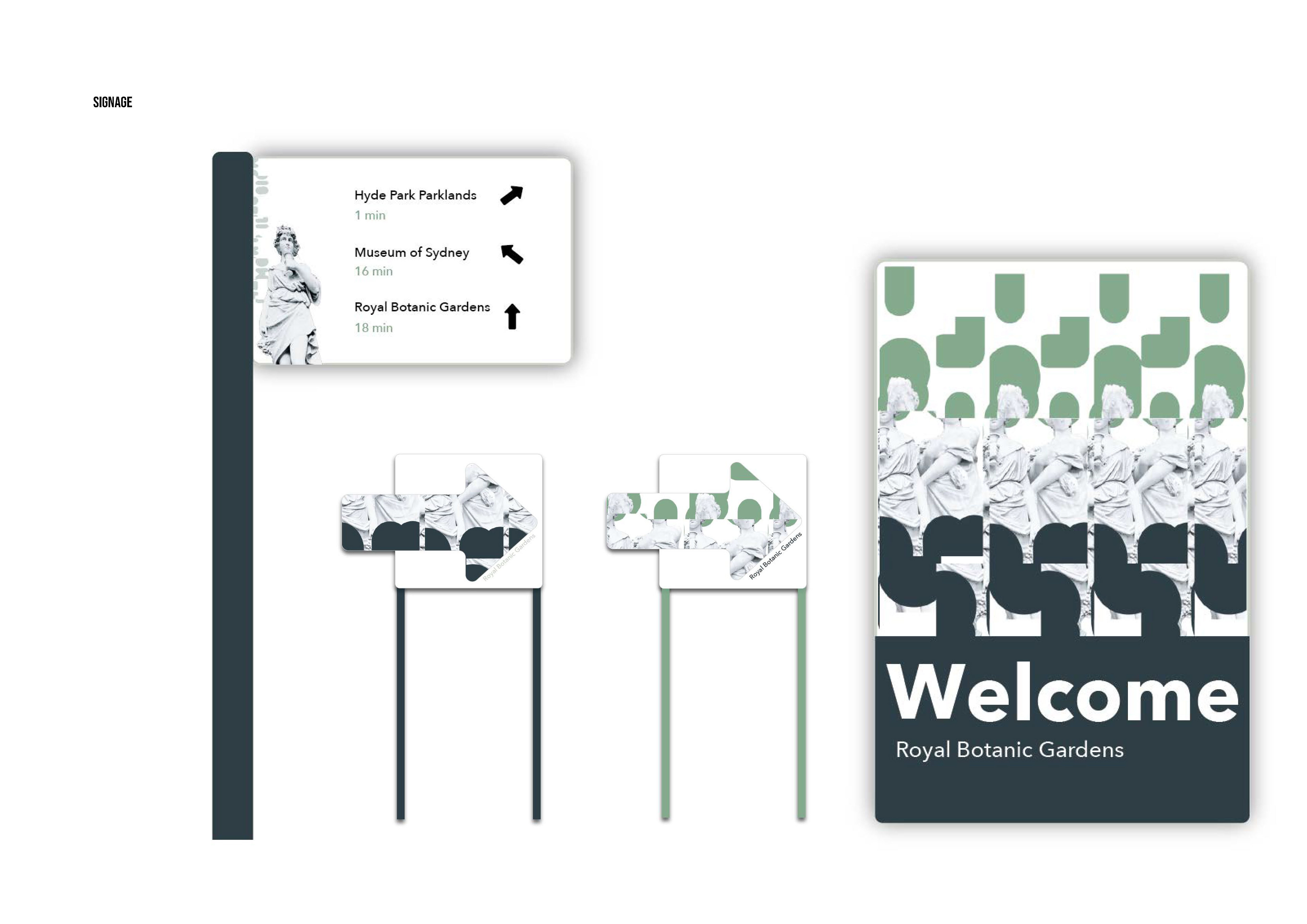
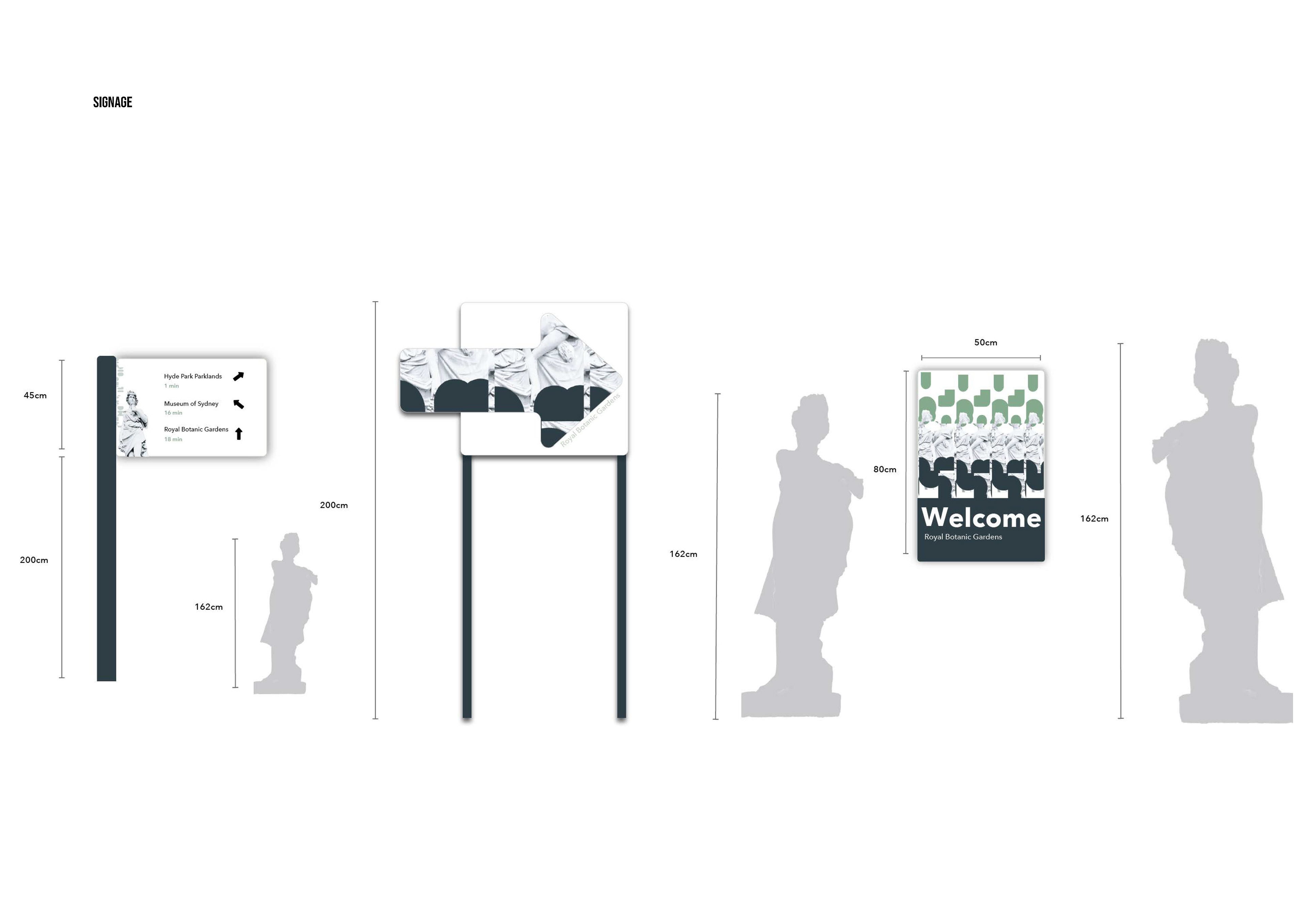
I approached the intervention through photography and typography art. I was inspired by the works of Sakir Yildirim, an Istanbul-based photographer who created a series of distorted photographs using warp and liquifying tools (Yalav- Heckeroth, 2018). Influences for the intervention visuals came from my habitual Sunday morning walks around Sydney Harbour and the Royal Botanic Gardens. The Statues of the Four Seasons, located in the Royal Botanic Gardens, are the embodiment of memory retrieval and through the distortion of the 4 marble structures, I tell a story of illusion in memory. As for the repetition of words that appear exaggerated and borderless, they portray deterioration of the original memory and the fragmented pieces can be used to create a new narrative.
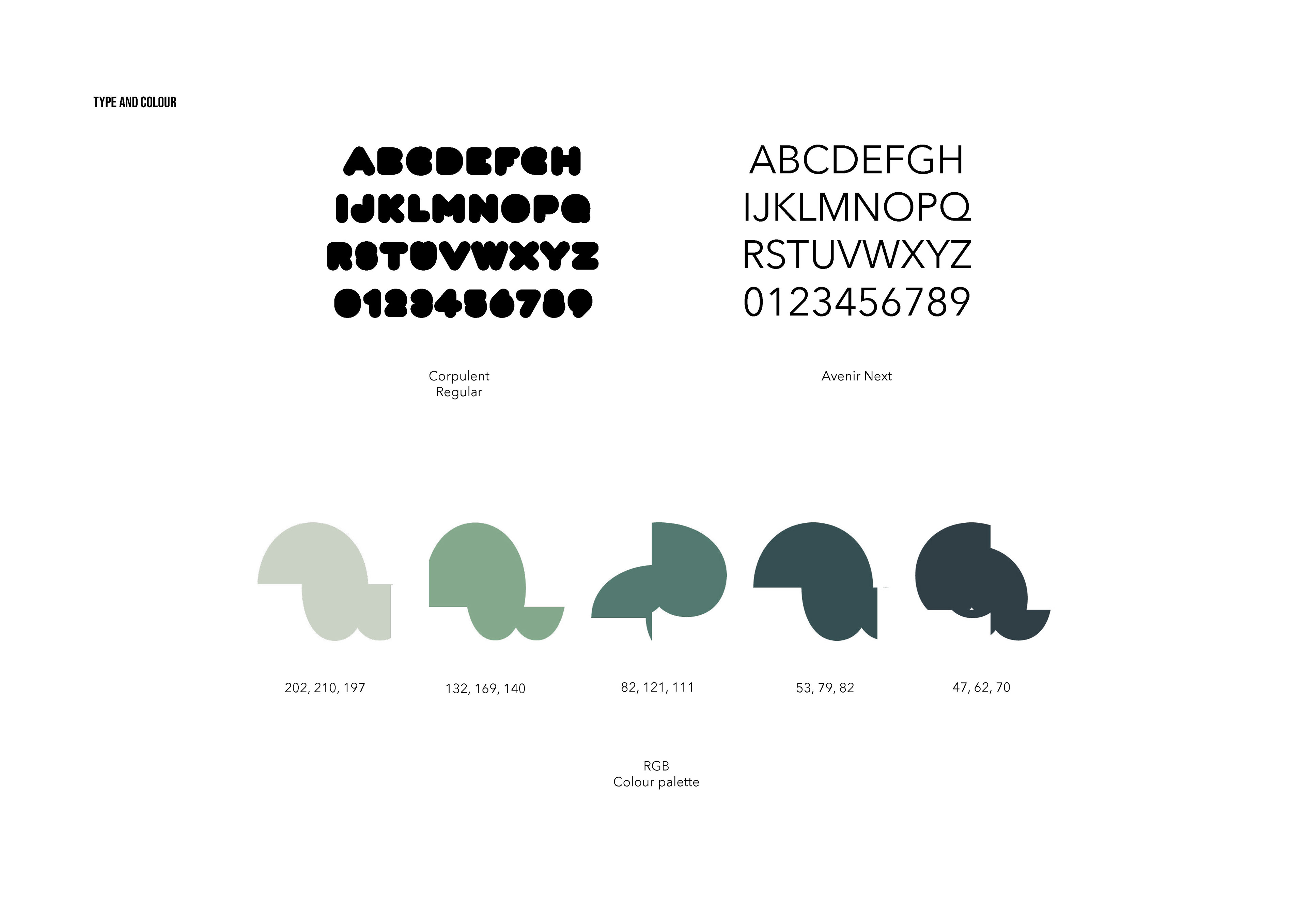
The colour palette, a range of green hues, were chosen to complement the existing interior of the apartment building in which the intervention will be displayed. In colour psychology, green is associated with creativity and tranquility (Cherry, 2021). One could argue that the reconstructed memories are narratives fabricated from different parts of a memory and therefore considered a ‘creative’ interpretation of an event. The main typeface, Corpulent, was chosen to achieve a high level of contrast and legibility as well as accomplishing continuity with the manipulated greyscale statues. As a secondary typeface, I chose Avenir Next, a fitting sans-serif style that compliments the rounded, heavy-set main typeface.
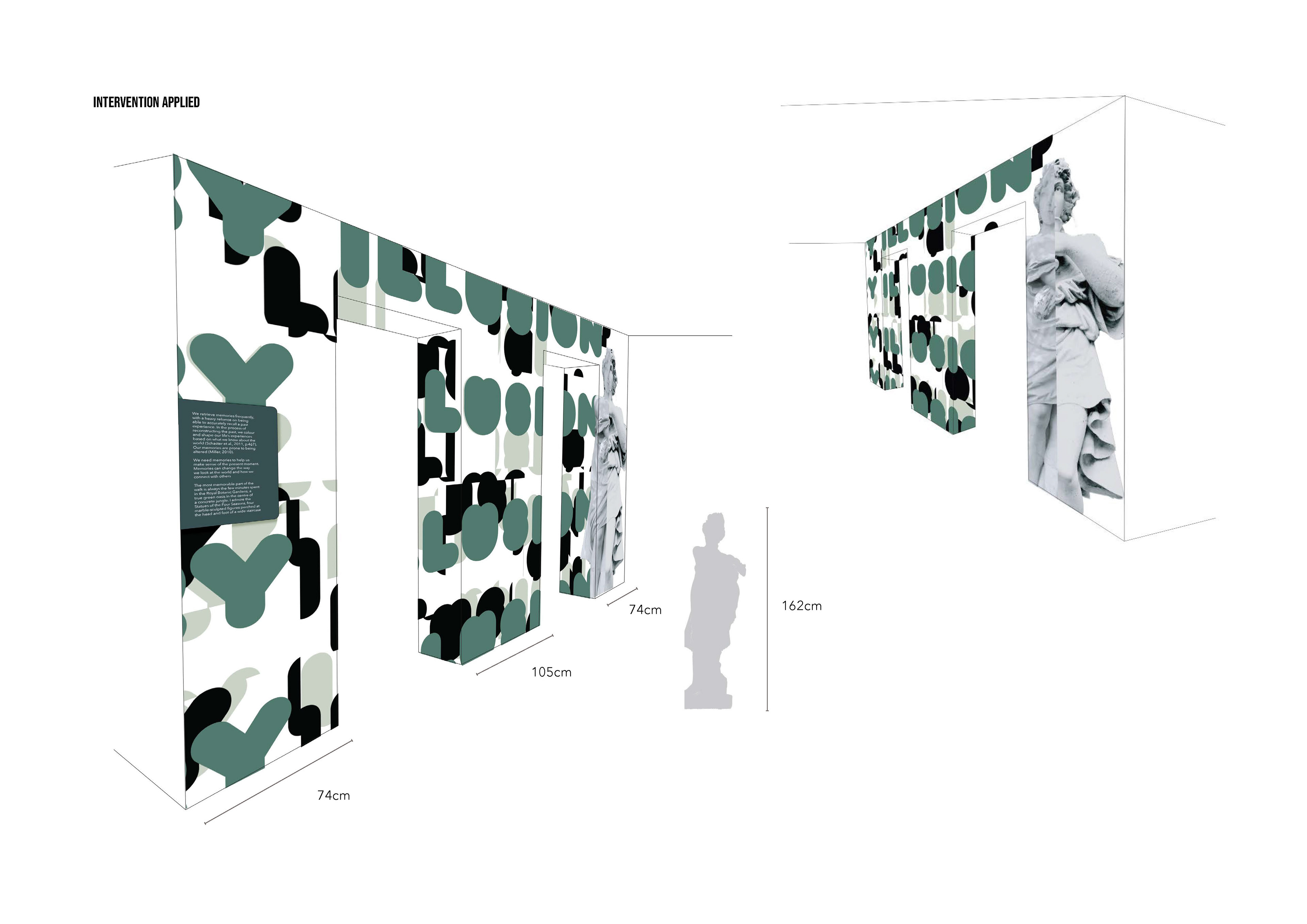
Assisting the concept of distorted memories, I chose to apply the intervention on the frame of the elevator doors on the 3rd floor of the apartment building. This was to further support the concept as the spectator steps through the elevator door and is ‘transported’ to another level, just like memories transport us to another time. The intervention contains a second 3-dimensional part, delivered through an AR experience, both inside of the elevator and on the wall opposite the elevator doors. For the wayfinding component of the project, I designed a system of navigation to the Royal Botanic Gardens which is approximately 18 minutes from the site of intervention.